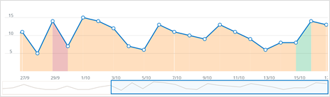
Time trend on the Dashboard
The Time trend tab shows how your feedback volume and sentiment score have changed over time.
-
Each dot shows the volume of feedback for that day; hover over it to see the specific date, amount of feedback on that date, and the average sentiment score for that date.
-
The color of the area under the line shows how your average sentiment score was that day; green means good, amber means neutral, and red means bad.
-
Right-click the chart to filter the data by preset date ranges; choose from Last week, Last month, Last 6 months, or Last year.
-
Right-click and select Freeze to lock the view, and it will stop responding to interface updates; to unfreeze, right-click and select Unfreeze.
Tip: Click a point of the chart or click and drag across a date range on the Time trend graph to filter the Dashboard.